
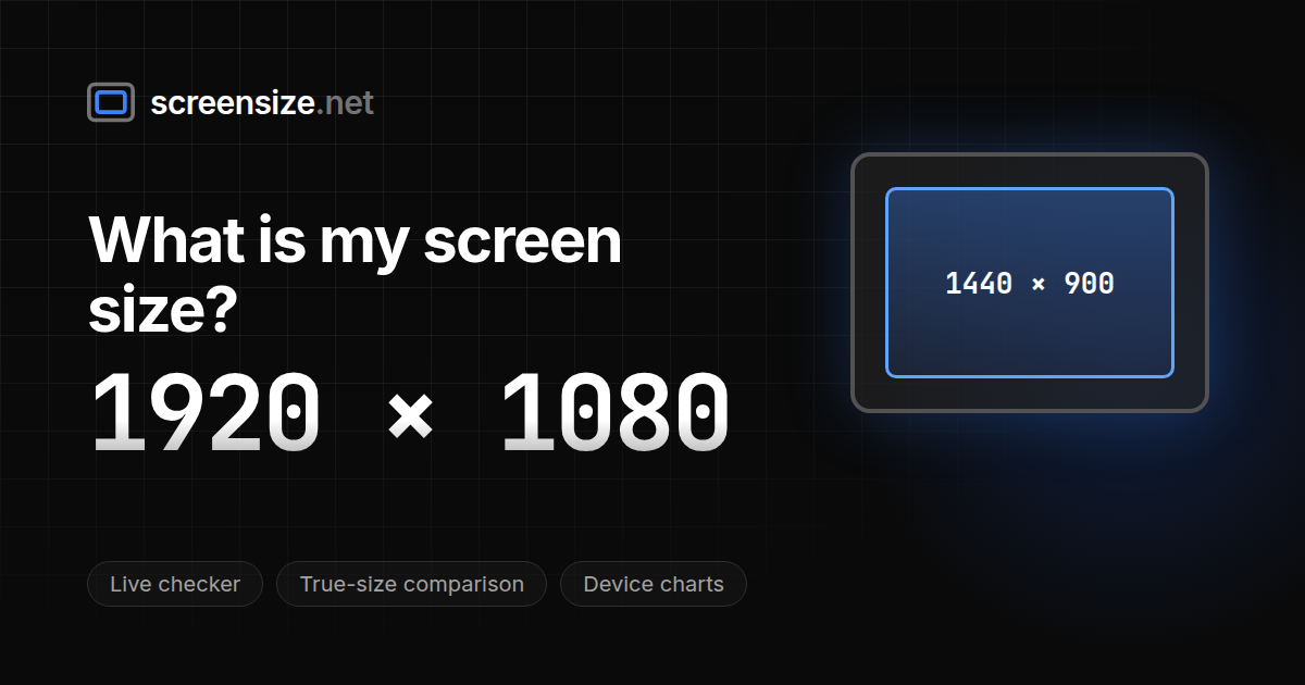
ScreenSize
Developer Tools, Design Tools, Web Development
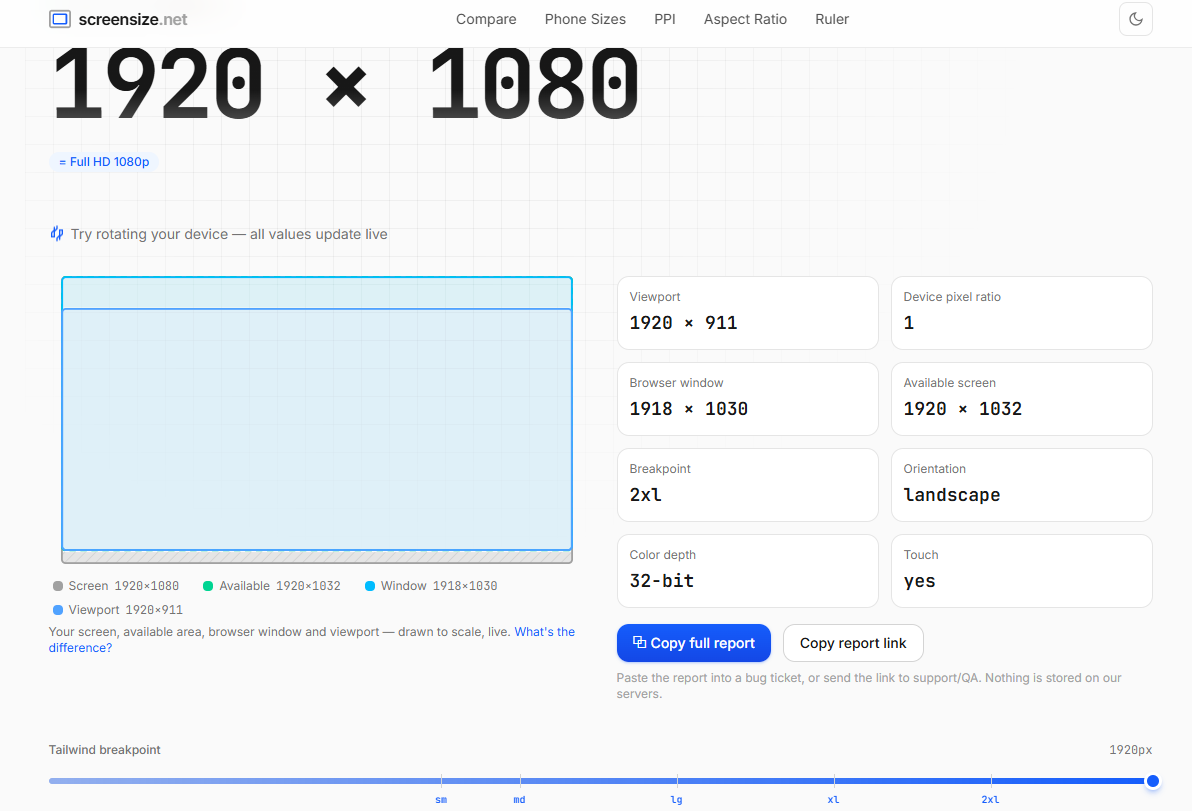
ScreenSize is a comprehensive, ad-free suite of display testing and calculation utilities built for web developers and UI/UX designers. It provides an all-in-one platform to instantly inspect CSS viewports, accurately calculate screen pixel density (PPI/DPI), find precise aspect ratios, and check device pixel ratios (DPR). The tool also features detailed, filterable specification and comparison charts for popular smartphones, tablets, and desktop monitors.
Features
- **Instant Viewport & Resolution Detection:** Automatically reads and displays your current browser viewport size and hardware screen resolution.
- **Advanced PPI & Aspect Ratio Calculators:** Input resolution and diagonal size to instantly get precise pixel density, dot pitch, and scaling metrics.
- **Device Comparison Charts:** Comprehensive, filterable data charts covering sizing and display specifications for iPhones, Galaxy devices, and standard monitors.
- **Interactive Developer Utilities:** Built-in tools including a device pixel ratio (DPR) checker and an accurate online ruler for cross-device testing.
Use Cases
- **Responsive Design Testing:** Front-end developers can verify layout behavior across different CSS breakpoints and custom viewport configurations.
- **Hardware Specification Lookup:** UI/UX designers and consumers can compare physical display sizes, screen dimensions, and pixel crispness before prototyping or purchasing.
- **Asset Optimization:** Mobile developers can check exact device pixel ratios (DPR) to ensure image assets and media queries render sharply on high-density displays.

Comments


Really useful tool for front-end work. The live viewport detection is spot on — no more guessing what breakpoint is actually firing. The device comparison charts are a nice touch too, especially filtering by phone vs monitor. Would love to see Tailwind and Bootstrap breakpoints highlighted directly on the viewport display.


ScreenSize looks very useful for web developers and UI/UX designers who need quick viewport, DPI/PPI, aspect ratio, and device pixel ratio checks in one place. I like that it combines multiple display-testing utilities instead of making users switch between different tools. A helpful improvement could be adding a few visual examples or common testing scenarios for responsive design workflows.

The viewport detection updates live as you resize - huge for catching responsive design breakpoints in action. Instead of bouncing between a dozen device spec sheets, everything's here. The DPR checker is the real time saver though - getting exact pixel ratios for image optimization on high-density screens usually means digging through manufacturer datasheets. Having it instantly available means designers actually use it instead of guessing.

The PPI calculator with dot pitch output is genuinely useful. I build web calculators myself and testing them across viewports is always a pain, so having viewport detection, DPR check and the device comparison charts in one ad-free place saves real time. Suggestion: a small embeddable widget of the viewport tester would be great for docs pages.
Premium Products


Sponsors
Buy
Awards
View all
Awards
View allMakers

Makers
Comments
Really useful tool for front-end work. The live viewport detection is spot on — no more guessing what breakpoint is actually firing. The device comparison charts are a nice touch too, especially filtering by phone vs monitor. Would love to see Tailwind and Bootstrap breakpoints highlighted directly on the viewport display.
ScreenSize looks very useful for web developers and UI/UX designers who need quick viewport, DPI/PPI, aspect ratio, and device pixel ratio checks in one place. I like that it combines multiple display-testing utilities instead of making users switch between different tools. A helpful improvement could be adding a few visual examples or common testing scenarios for responsive design workflows.
The viewport detection updates live as you resize - huge for catching responsive design breakpoints in action. Instead of bouncing between a dozen device spec sheets, everything's here. The DPR checker is the real time saver though - getting exact pixel ratios for image optimization on high-density screens usually means digging through manufacturer datasheets. Having it instantly available means designers actually use it instead of guessing.
The PPI calculator with dot pitch output is genuinely useful. I build web calculators myself and testing them across viewports is always a pain, so having viewport detection, DPR check and the device comparison charts in one ad-free place saves real time. Suggestion: a small embeddable widget of the viewport tester would be great for docs pages.
Premium Products
New to Fazier?

Find your next favorite product or submit your own. Made by @FalakDigital.
Copyright ©2025. All Rights Reserved