MobileReady
Test any website on real device frames in seconds and more.
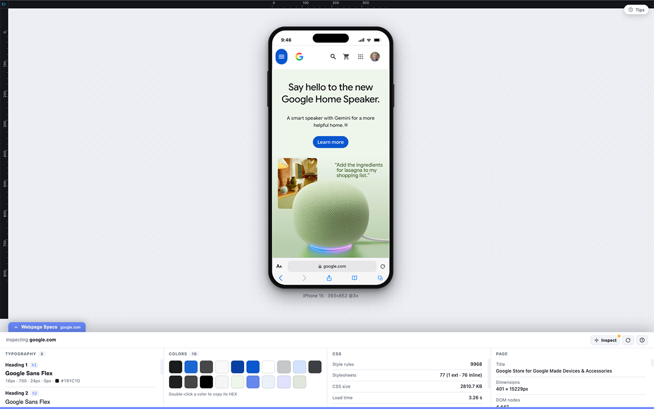
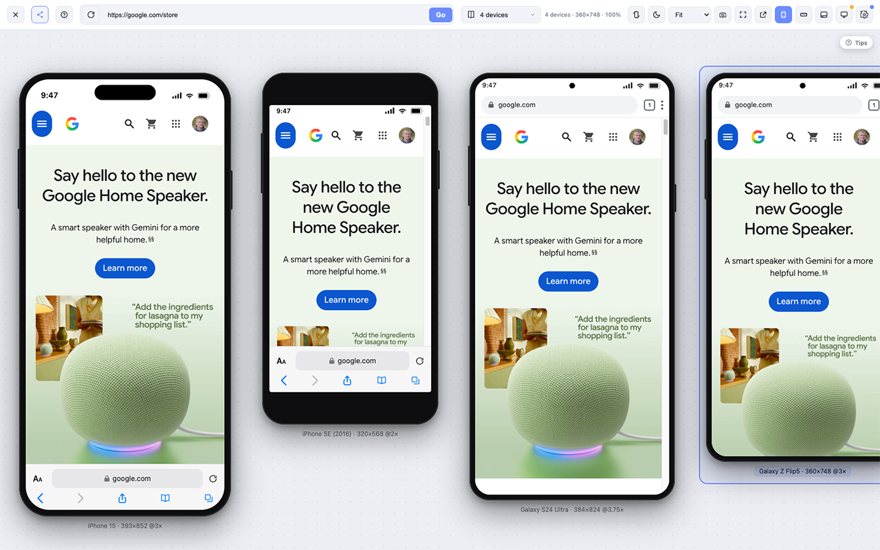
MobileReady lets developers, designers, marketers, and QA teams instantly preview any live website inside realistic mobile device frames directly in Chrome. Switch devices, inspect responsive layouts, compare designs, and catch mobile issues before your users do.
Features
-Realistic Mobile Device Preview
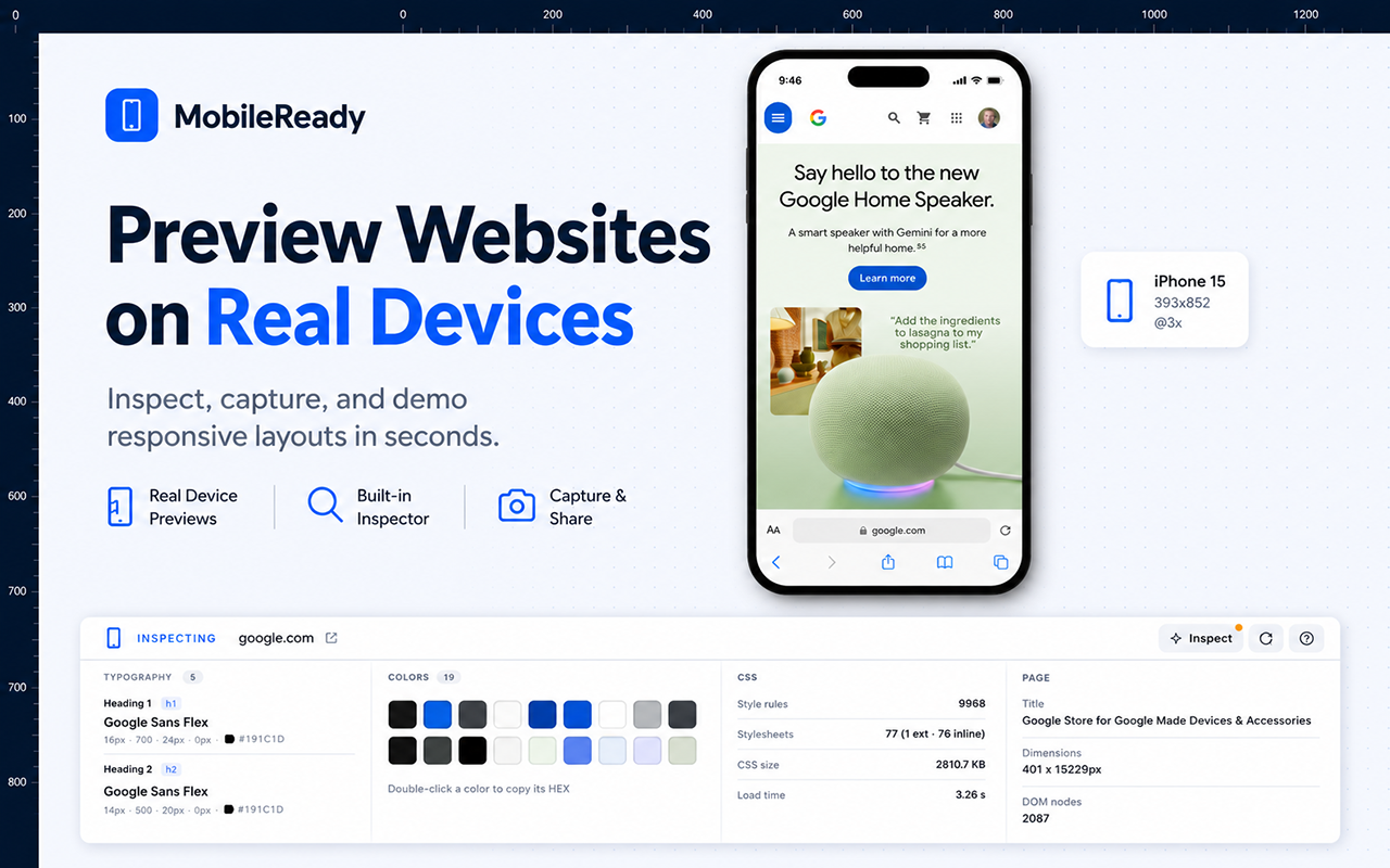
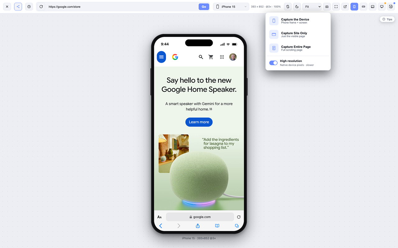
Preview any live website inside beautifully rendered mobile device frames without leaving Chrome.
-Instant Device Switching
Switch between popular smartphones with a single click to test responsive layouts faster.
-Pixel-Perfect Measurement Tools
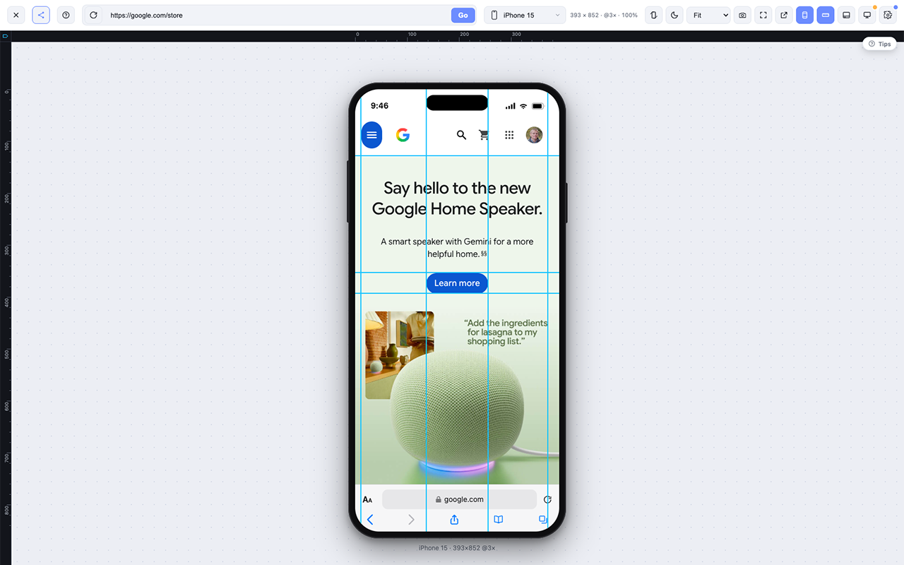
Measure spacing, margins, padding, element sizes, and alignment directly on the page.
-Alignment Guides & Rulers
Quickly verify layout consistency and pixel-perfect positioning across your designs.
-Advanced Color Picker
Identify, inspect, and copy colors from any element while viewing your site on mobile.
-Font Detection
Instantly identify font families, weights, sizes, line heights, and typography details.
-Live CSS Editing
Modify styles in real time and copy the generated CSS directly into your project.
-High-Definition Screenshots
Capture crisp, high-resolution screenshots of your mobile previews for QA, client approvals, and documentation.
-Responsive QA Testing
Quickly uncover overflow, spacing, typography, and layout issues before your users do.
-Works on Live Websites
Test any live website without needing a local development setup.
-Faster Development Workflow
Replace multiple browser extensions with one unified responsive testing workspace.
-Built for Developers
Designed specifically for front-end developers, Shopify developers, WordPress developers, designers, QA engineers, and agencies.
Use Cases
Shopify Theme Development
Build, customize, and QA Shopify storefronts with confidence. Quickly verify responsive layouts, inspect styles, and capture screenshots before publishing.
WordPress Development
Perfect for Elementor, Bricks, Gutenberg, Divi, WooCommerce, and custom themes to ensure every page looks great on mobile devices.
UI/UX Design Reviews
Compare designs against live websites, verify spacing, typography, colors, and alignment without leaving your browser.
Responsive Website Testing
Instantly preview websites across multiple mobile devices and identify layout issues before users discover them.
Quality Assurance (QA)
Catch responsive bugs, overflowing content, broken layouts, inconsistent spacing, and visual regressions during testing.
Front-End Development
Inspect live websites, test CSS changes, measure elements, identify fonts and colors, and streamline your development workflow.
Landing Page Optimization
Verify that marketing pages, sales funnels, and lead generation pages look polished across popular mobile devices.
E-commerce Store Reviews
Test product pages, collection pages, carts, and checkout flows for a seamless mobile shopping experience.
Client Website Reviews
Share high-quality screenshots, document issues, and provide professional feedback without switching between multiple tools.
Pre-Launch Website Audits
Perform a final mobile review before launching a website to catch last-minute responsive issues.
Learning Responsive Design
Students and junior developers can visualize how websites adapt across devices while learning responsive design principles.
Content Creation
Capture beautiful mobile screenshots for tutorials, blog posts, presentations, documentation, and social media.
Competitive Research
Analyze how competitors implement responsive layouts, typography, spacing, navigation, and mobile user experience.
SEO & Core Web Vitals Reviews
Identify mobile layout problems that can affect user experience and indirectly impact search performance.
Digital Agencies
Replace multiple browser extensions with a single, streamlined toolkit for designers, developers, project managers, and QA teams.

Comments

Love this! Wishing you great success! Edit by https://survivalrace.io a day ago

Cross-device responsive testing is one of the biggest time sinks in web development. Most developers end up manually resizing browsers or swapping between devices, then wrestling with browser dev tools to find and fix layout issues. Having a unified tool that instantly shows your live site on every popular device frame eliminates so much debugging friction. The ability to measure spacing, inspect colors, test styles without context-switching means developers spend less time in setup and more time actually shipping. For QA and design review teams, having a single source of truth to catch responsive regressions before they hit users is invaluable - the pixel-perfect measurement tools mean you catch layout shifts that would otherwise slip through.

The responsive testing workflow is brutal for designers and developers - you're juggling multiple browser extensions, device emulators, and manual checking. By the time you catch a layout bug on tablet view, it's already been pushed to staging or worse. Having all your responsive QA in one place in Chrome completely removes that tool-switching friction and lets you catch layout problems instantly while actually working on the design. The pixel-perfect measurement and live CSS editing make it possible to verify and fix responsive issues without ever leaving the browser.

The combination of device frames, measurement tools, and live CSS edits could make this more useful than a simple viewport switcher. For launch-page QA, the most valuable workflow would be comparing a few target devices side by side, then keeping a small list of reproducible findings with screenshots. It would be great to see whether those measurements and CSS experiments can be exported with enough context for a developer to apply the fix quickly.



MobileReady has great potential! A few improvements could make it even better. I'd love to share my feedback and suggestions. WhatsApp: https://wa.me/447307349530 Telegram: t.me/rforrank


The strongest use case here feels like pre-launch QA for small teams. I like that it combines device frames, screenshots, measurement, font checks, and live CSS editing instead of making people jump between multiple extensions. One thing I would make very obvious on the landing page is the exact “before publishing” workflow: open site, switch devices, catch overflow/spacing issues, export screenshots for fixes. That would make the value click even faster for agencies and indie makers.

Combining device frames with measurements and live CSS editing is much more useful than a simple viewport switcher. For QA handoff, it would be valuable if each screenshot could include the viewport, DPR, URL, and a short note, then export a shareable report so developers have enough context to reproduce the issue. Does MobileReady emulate only viewport dimensions, or also DPR, touch input, safe-area insets, and user agent?
Premium Products



































Sponsors
Buy
Makers

Makers
Comments
Love this! Wishing you great success! Edit by https://survivalrace.io a day ago
Cross-device responsive testing is one of the biggest time sinks in web development. Most developers end up manually resizing browsers or swapping between devices, then wrestling with browser dev tools to find and fix layout issues. Having a unified tool that instantly shows your live site on every popular device frame eliminates so much debugging friction. The ability to measure spacing, inspect colors, test styles without context-switching means developers spend less time in setup and more time actually shipping. For QA and design review teams, having a single source of truth to catch responsive regressions before they hit users is invaluable - the pixel-perfect measurement tools mean you catch layout shifts that would otherwise slip through.
The responsive testing workflow is brutal for designers and developers - you're juggling multiple browser extensions, device emulators, and manual checking. By the time you catch a layout bug on tablet view, it's already been pushed to staging or worse. Having all your responsive QA in one place in Chrome completely removes that tool-switching friction and lets you catch layout problems instantly while actually working on the design. The pixel-perfect measurement and live CSS editing make it possible to verify and fix responsive issues without ever leaving the browser.
The combination of device frames, measurement tools, and live CSS edits could make this more useful than a simple viewport switcher. For launch-page QA, the most valuable workflow would be comparing a few target devices side by side, then keeping a small list of reproducible findings with screenshots. It would be great to see whether those measurements and CSS experiments can be exported with enough context for a developer to apply the fix quickly.
MobileReady has great potential! A few improvements could make it even better. I'd love to share my feedback and suggestions. WhatsApp: https://wa.me/447307349530 Telegram: t.me/rforrank
The strongest use case here feels like pre-launch QA for small teams. I like that it combines device frames, screenshots, measurement, font checks, and live CSS editing instead of making people jump between multiple extensions. One thing I would make very obvious on the landing page is the exact “before publishing” workflow: open site, switch devices, catch overflow/spacing issues, export screenshots for fixes. That would make the value click even faster for agencies and indie makers.
Combining device frames with measurements and live CSS editing is much more useful than a simple viewport switcher. For QA handoff, it would be valuable if each screenshot could include the viewport, DPR, URL, and a short note, then export a shareable report so developers have enough context to reproduce the issue. Does MobileReady emulate only viewport dimensions, or also DPR, touch input, safe-area insets, and user agent?
Premium Products
New to Fazier?

Find your next favorite product or submit your own. Made by @FalakDigital.
Copyright ©2026. All Rights Reserved