Sundial: Time Marks
Your year and your life, drawn as quiet marks of ink
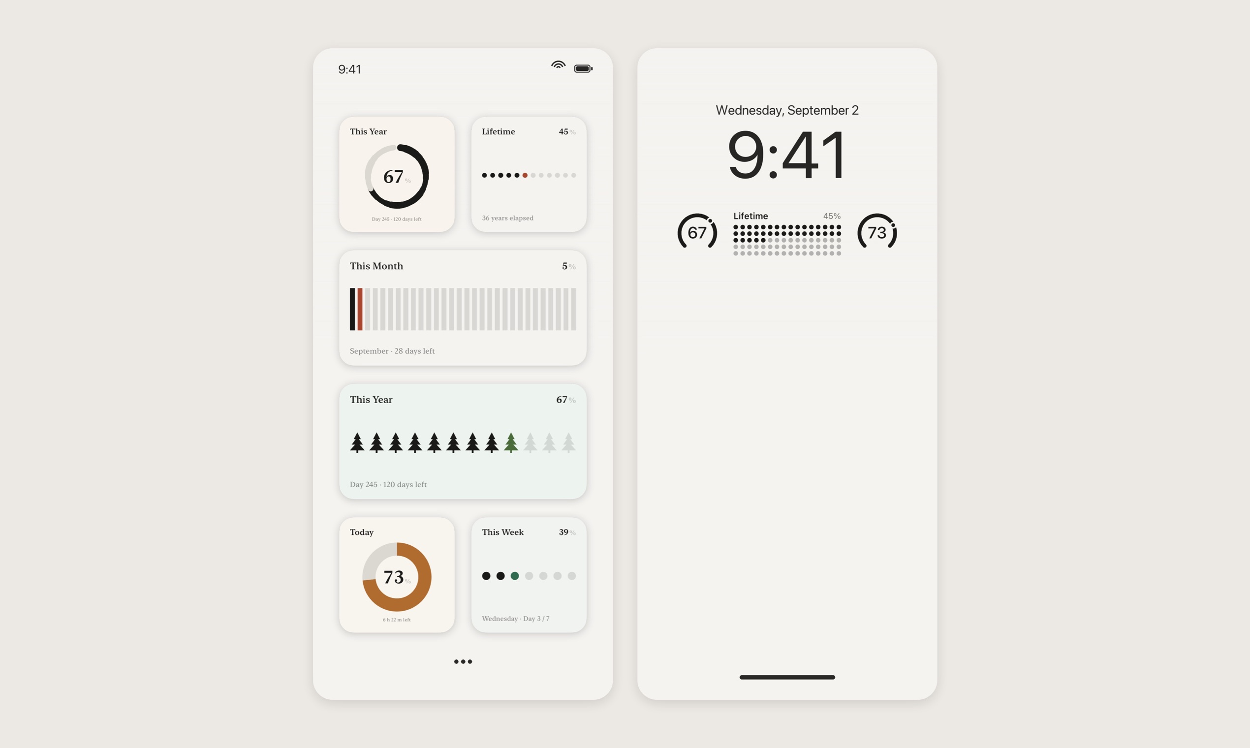
Sundial draws today, this week, this month, this year and your whole life as rows of marks on your Home Screen and Lock Screen: ink for what has passed, one vermilion mark for now, pale grey for what is still ahead.
The Chinese name is 岁时 (suì shí). 岁 originally meant Jupiter, the planet ancient astronomers used to count years, so a year was first something you saw, not something you counted. That is the whole idea: time you can see at a glance.
Solo-made. Data stays on your device and in your private iCloud. No accounts, no ads.
Features
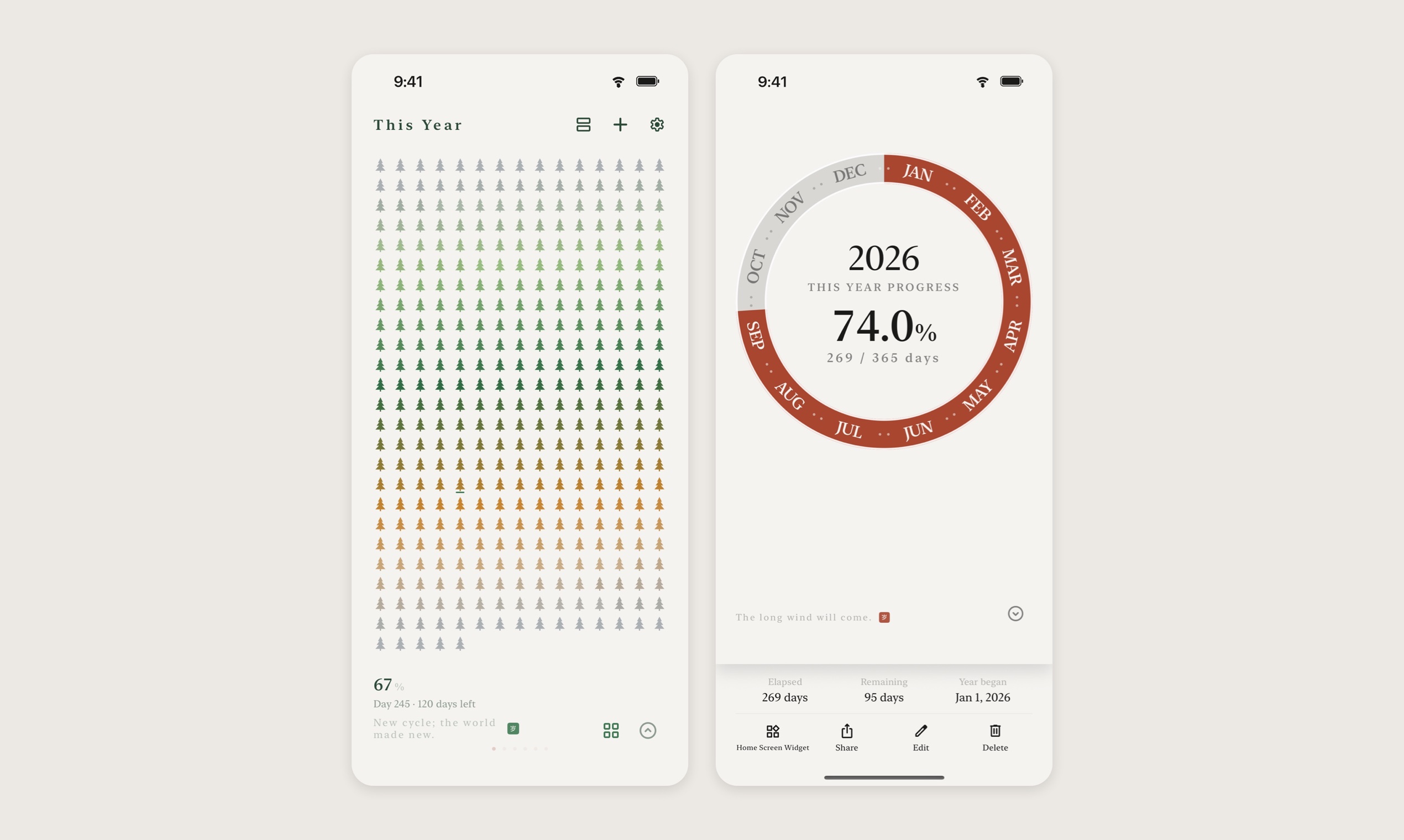
- Seven cycles: today, week, month, quarter, year, lunar year and lifetime
- Countdowns and count-ups to any date
- Home Screen and Lock Screen widgets in every size
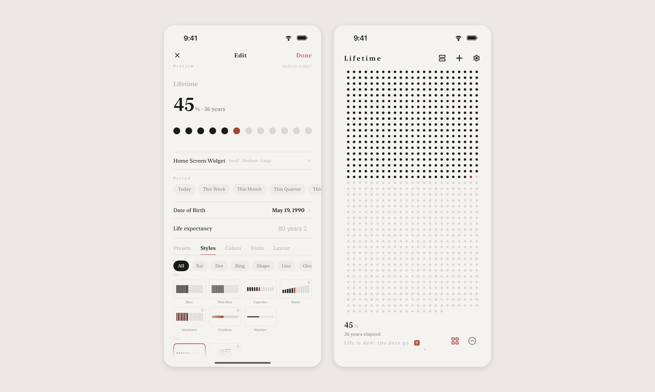
- 26 styles, from a hairline to pine trees and moon phases
- A lifetime grid drawn from your birthday
- Private: on-device and your own iCloud only
Use Cases
- Glance at how much of the year is left without opening an app
- Keep a countdown to a trip, exam or launch on the Lock Screen
- A calm memento mori: your life as a notebook only half written
- A minimal paper-and-ink Home Screen setup

Comments


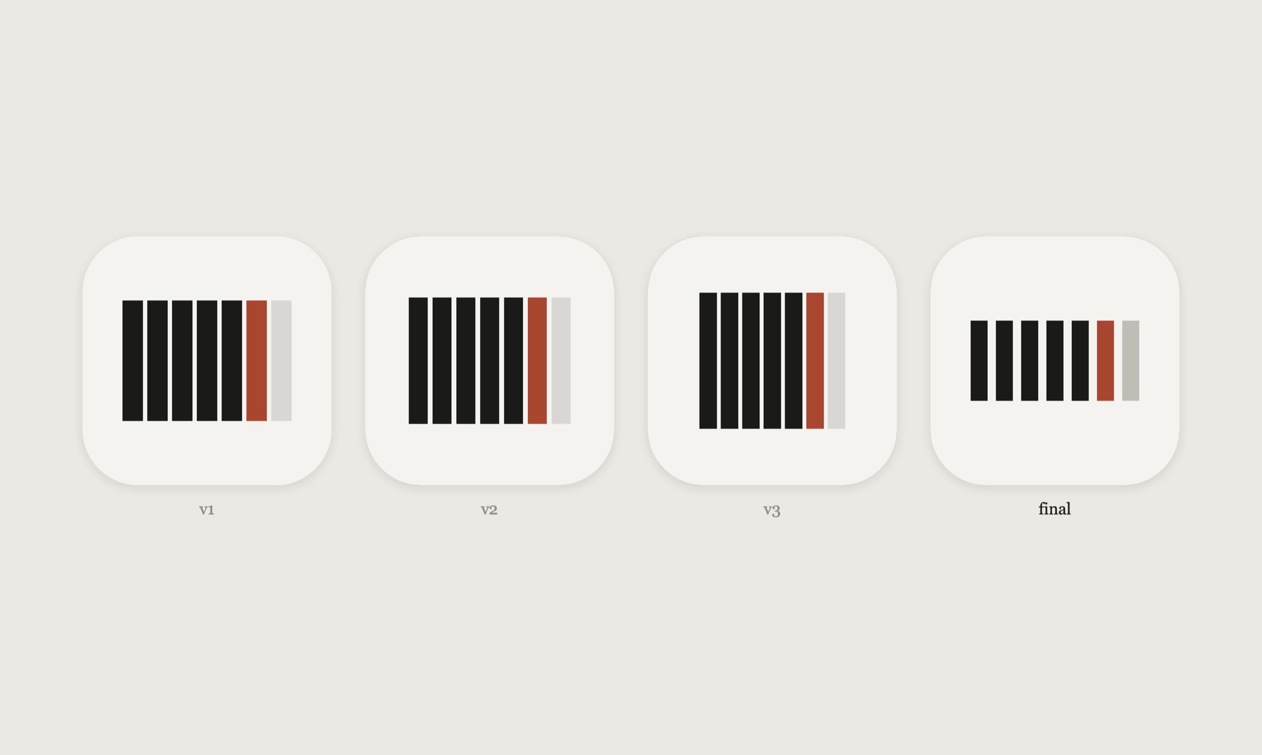
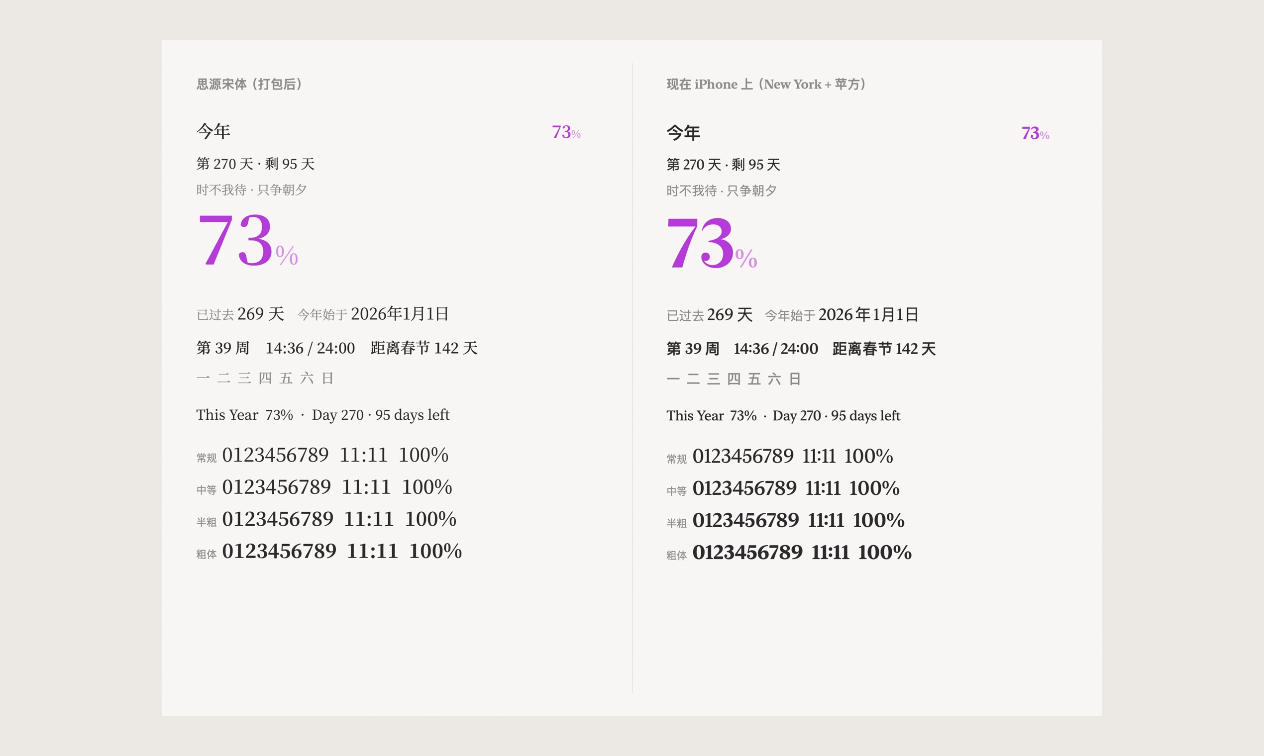
Hi Fazier! I'm the solo developer. The app was almost called SUISHI, the romanization of its Chinese name 岁时. Then I noticed that English readers see "sushi", so it became Sundial. 岁 originally meant Jupiter: ancient astronomers counted years by where it stood in the sky. A year was first something you saw, not something you counted. That is what the app tries to do: put the day, the year and your life on your Home Screen as marks you can see at a glance. Two small things I spent too long on: the icon (my first version turned out to share all three strongest traits with a 2015 app, so I rebuilt it) and the typeface (a trimmed Source Han Serif with tabular figures, so widget percentages stop jiggling). I'd love to hear which style you would keep on your Home Screen.

The idea of ink for the past, a single vermilion mark for now and pale grey for what's ahead is a lovely way to show time at a glance. With the lifetime grid drawn from a birthday, do you let people choose an expected lifespan, and can the Lock Screen widget stay legible when the 26 styles get dense, like the pine trees?



The 岁时 story is a lovely anchor for the whole app: time you see rather than count. The single vermilion mark for "now" is a strong choice too, it gives the eye one place to land. Is the lifetime grid based on a fixed life expectancy, or can you set your own end date? I'd also love a monochrome style that matches iOS tinted widgets.



Showing time as marks rather than a percentage feels calmer and easier to grasp at a glance, especially on a Lock Screen widget. The lifetime grid drawn from a birthday is the most distinctive part, and having seven cycles from a day up to a lunar year gives it more depth than a simple countdown app. Keeping everything on-device and in private iCloud also fits the quiet design. It would be interesting to see whether the countdown and count-up dates can share the same widget style without breaking that minimal look.


Including the lunar year as one of the cycles is a lovely touch, and it's rare in apps like this. Could countdowns also be set by lunar date? Things like the Mid-Autumn Festival or a family member's lunar birthday move every year on the Gregorian calendar, so a countdown that recalculates itself each year would fit the app's idea of seeing time at a glance.


Showing the week and month as marks next to the year is what makes this work for me. A percentage tells you the number, but a half-filled row of ink actually feels like time passing. I build browser timers, and the hardest part there is the same as yours: keeping a countdown calm instead of stressful. Does the countdown widget also switch to the vermilion 'now' mark on the day itself, or does it simply finish?
Premium Products






































Sponsors
Buy

Awards
View all
Awards
View allMakers
Makers
Comments
Hi Fazier! I'm the solo developer. The app was almost called SUISHI, the romanization of its Chinese name 岁时. Then I noticed that English readers see "sushi", so it became Sundial. 岁 originally meant Jupiter: ancient astronomers counted years by where it stood in the sky. A year was first something you saw, not something you counted. That is what the app tries to do: put the day, the year and your life on your Home Screen as marks you can see at a glance. Two small things I spent too long on: the icon (my first version turned out to share all three strongest traits with a 2015 app, so I rebuilt it) and the typeface (a trimmed Source Han Serif with tabular figures, so widget percentages stop jiggling). I'd love to hear which style you would keep on your Home Screen.
The idea of ink for the past, a single vermilion mark for now and pale grey for what's ahead is a lovely way to show time at a glance. With the lifetime grid drawn from a birthday, do you let people choose an expected lifespan, and can the Lock Screen widget stay legible when the 26 styles get dense, like the pine trees?
The 岁时 story is a lovely anchor for the whole app: time you see rather than count. The single vermilion mark for "now" is a strong choice too, it gives the eye one place to land. Is the lifetime grid based on a fixed life expectancy, or can you set your own end date? I'd also love a monochrome style that matches iOS tinted widgets.
Showing time as marks rather than a percentage feels calmer and easier to grasp at a glance, especially on a Lock Screen widget. The lifetime grid drawn from a birthday is the most distinctive part, and having seven cycles from a day up to a lunar year gives it more depth than a simple countdown app. Keeping everything on-device and in private iCloud also fits the quiet design. It would be interesting to see whether the countdown and count-up dates can share the same widget style without breaking that minimal look.
Including the lunar year as one of the cycles is a lovely touch, and it's rare in apps like this. Could countdowns also be set by lunar date? Things like the Mid-Autumn Festival or a family member's lunar birthday move every year on the Gregorian calendar, so a countdown that recalculates itself each year would fit the app's idea of seeing time at a glance.
Showing the week and month as marks next to the year is what makes this work for me. A percentage tells you the number, but a half-filled row of ink actually feels like time passing. I build browser timers, and the hardest part there is the same as yours: keeping a countdown calm instead of stressful. Does the countdown widget also switch to the vermilion 'now' mark on the day itself, or does it simply finish?
Premium Products
New to Fazier?

Find your next favorite product or submit your own. Made by @FalakDigital.
Copyright ©2026. All Rights Reserved