
Screen Size Checker
The professional toolkit for responsive design.
- The professional toolkit for developers & designers to check screen size, resolution, PPI, and aspect ratio. Stop guessing, start building.
Features
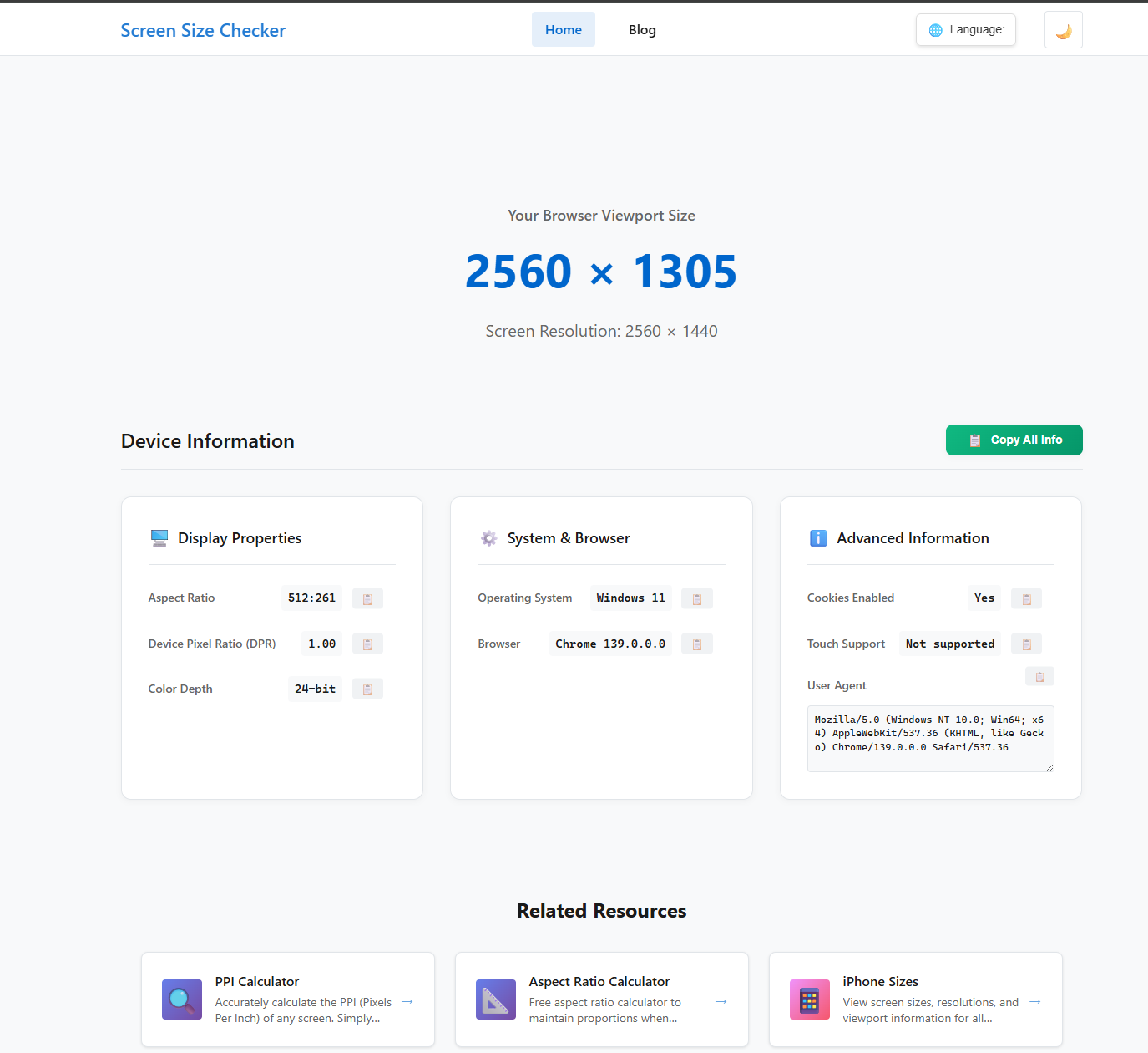
- Instant real-time detection of screen size, resolution, and DPR.
- A full suite of interactive tools: PPI Calculator, Aspect Ratio Calculator, and more.
- Comprehensive and searchable device databases for iPhone, iPad, and Android.
- A free, built-in responsive tester to check your website's layout.
- In-depth technical blog with guides on viewport, media queries, and responsive design.
Use Cases
- Frontend Developers debugging complex responsive CSS layouts and checking exact media query breakpoints.
- UI/UX Designers planning user interfaces for specific devices (like the latest iPhone or Android models) using our comprehensive screen spec databases.
- QA Testers verifying website responsiveness and reporting precise screen data (resolution, viewport, DPR) for accurate bug reports.
- Product Managers making data-driven decisions by referencing the most common screen sizes for different device types.
- Technical Support Teams guiding users to get accurate screen information in one click for faster issue resolution.
- Anyone wanting to instantly calculate the Pixel Density (PPI) or Aspect Ratio for any screen or image.

Comments


Check out this awesome tool for responsive design! It really helps streamline development. And if you enjoy fun games, visit スイカゲーム https://suikagames.net for some great puzzles!

ジオメトリーダッシュ https://geometrydashja.com
Pokepath TD https://pokepathtd.app/
Scritchy Scratchy https://scritchyscratchy.org
<a href="https://geometrydashja.com/">ジオメトリーダッシュ</a> & スクラッチゲーム - 無料プレイ | GeometryDashJA
[スイカゲーム 無料](https://suikagameja.com/)
https://geometry-world.com Geometry Dash World
https://suikagameja.com/ Suika Game
Premium Products


Sponsors
Buy


Comments
Check out this awesome tool for responsive design! It really helps streamline development. And if you enjoy fun games, visit スイカゲーム https://suikagames.net for some great puzzles!
ジオメトリーダッシュ https://geometrydashja.com
Pokepath TD https://pokepathtd.app/
Scritchy Scratchy https://scritchyscratchy.org
<a href="https://geometrydashja.com/">ジオメトリーダッシュ</a> & スクラッチゲーム - 無料プレイ | GeometryDashJA
[スイカゲーム 無料](https://suikagameja.com/)
https://geometry-world.com Geometry Dash World
https://suikagameja.com/ Suika Game
Premium Products
New to Fazier?

Find your next favorite product or submit your own. Made by @FalakDigital.
Copyright ©2025. All Rights Reserved