
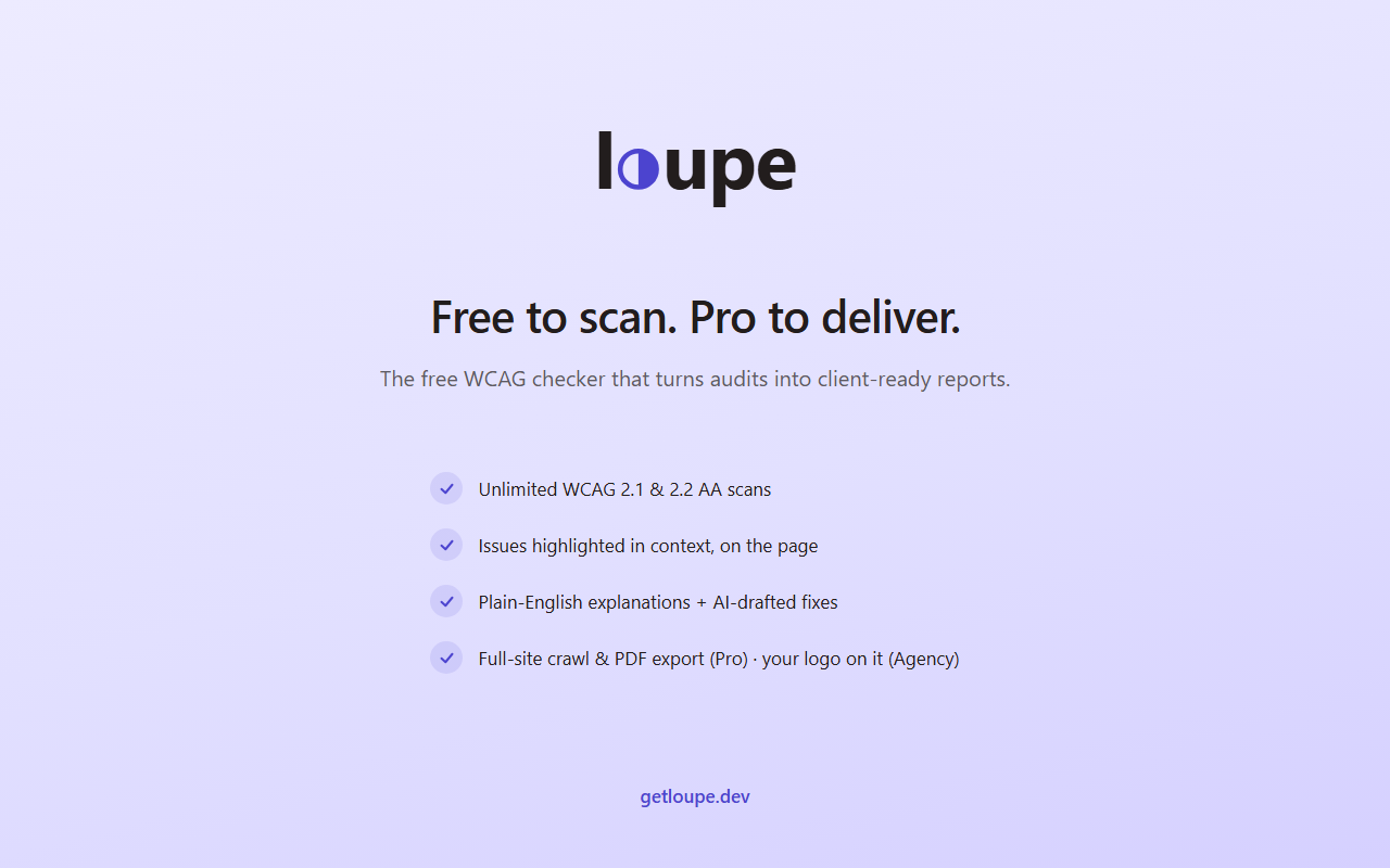
Loupe is a free Chrome and Edge extension that checks any web page for accessibility problems and explains how to fix each one in plain English.
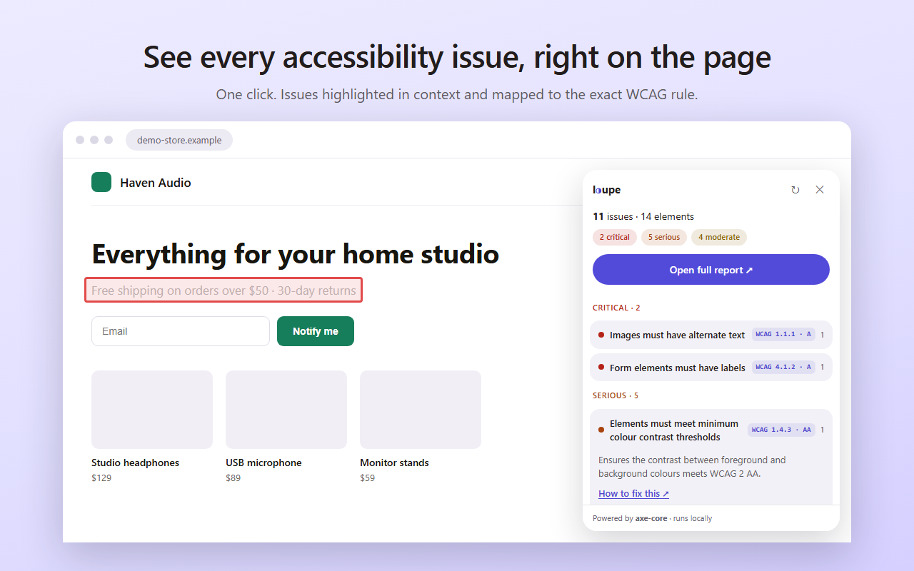
Click the icon and Loupe scans the page with axe-core, the same engine used by many professional accessibility tools. Every issue is highlighted right on the page, with the element, the WCAG 2.1 or 2.2 rule it breaks, and what to change. You don't need to be an accessibility expert to understand the results.
Scans run in your browser. No account, no signup, and your pages never leave your computer.
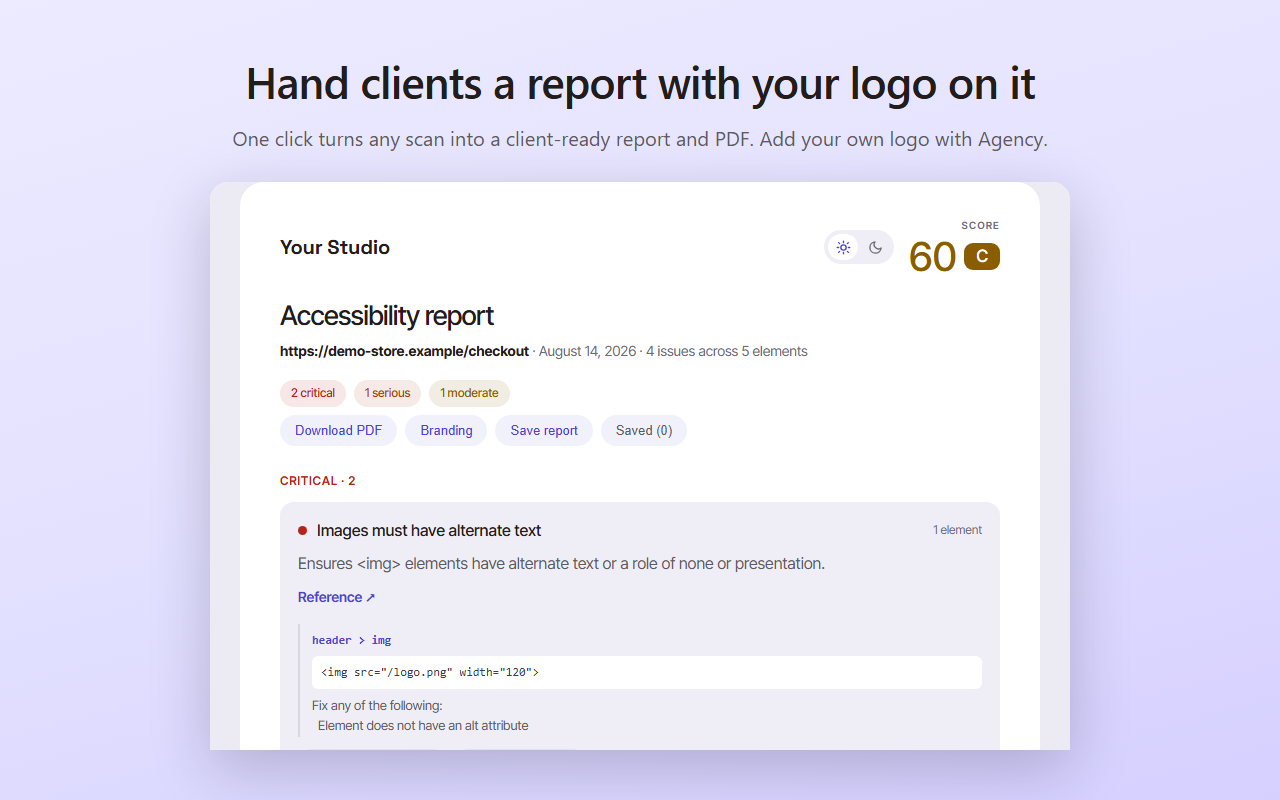
For agencies and freelancers, there's an optional paid plan that turns a scan into a branded PDF report you can hand to clients.
Built for web developers, designers, and site owners who want a quick accessibility check before launch, or before a real audit.
Features
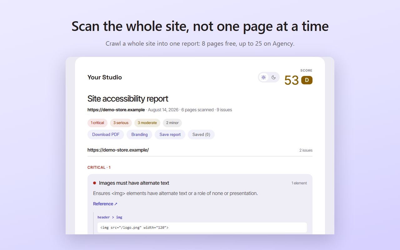
- Scans any web page for accessibility issues in one click
- Highlights each issue right on the page
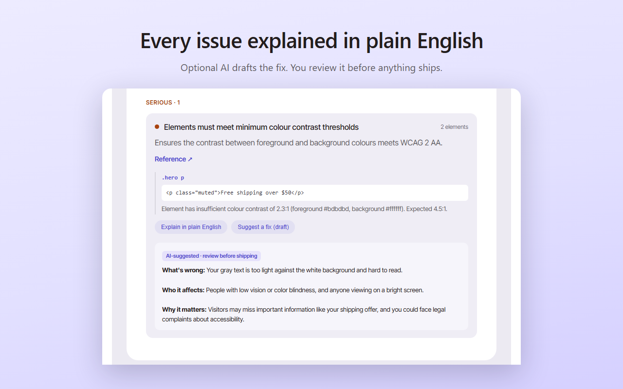
- Explains every fix in plain English
- Checks against WCAG 2.1 and 2.2, powered by axe-core
- Shows the exact element and WCAG rule for each issue
- Runs entirely in your browser, with no account or signup
- Free to use on Chrome and Edge
- Optional branded PDF reports for agencies and freelancers
Use Cases
- Check a new site for accessibility problems before launch
- Find and fix WCAG issues before a professional audit
- Learn accessibility as you go, with each fix explained
- Review client sites and hand over a branded report
- Spot-check pages after a redesign or content update
- Do a quick check for ADA and European Accessibility Act risks
Comments


The honesty about the automated-testing ceiling (roughly a third of WCAG issues are machine-checkable) is what builds trust in the other two thirds — most tools bury that caveat. Plain-English fixes are the other differentiator: an axe rule ID means nothing to the designer who has to fix the contrast. Question for the maker: can Loupe re-scan after the page changes, for dynamic content like modals or form validation errors? That is where single-shot scanners fall apart for real app workflows.

The branded PDF is the part agencies will lean on, especially now that the European Accessibility Act applies and clients ask "are we compliant?". Two things would make that report safer to hand over: a short list of the manual checks a scan can't cover (keyboard order, focus states, screen-reader labels), and a before-and-after view when you re-scan the same page after the fixes.

A free checker that explains every WCAG fix is more useful than a score alone. Most audits dump a contrast ratio and leave you guessing which element to change. If Loupe names the node and the exact fix, that is the difference between a report you file and one a developer can ship from. I would want to see how it handles a component that fails contrast only in a hover state.

Plain-English fixes next to the WCAG rule is the right call — "color-contrast" means nothing to the designer who has to pick the new colour. One gap I would surface explicitly: axe-core cannot see into cross-origin iframes or closed shadow roots, so a widget-heavy page (payments, chat, embedded forms) can come back clean while the riskiest parts were never scanned. A "3 frames could not be scanned" line in the results and in the branded PDF would keep agencies honest about what a clean scan does and does not cover.

Explaining each fix in plain English, with the exact element and WCAG rule highlighted on the page, is the part that makes this useful for non-specialists. For contrast failures, does Loupe suggest a specific replacement color pair that would pass AA or AAA, or does it leave choosing the new colors to the designer? I would also like to know whether the branded PDF report groups repeated issues, such as the same navigation link failing on many pages, so an agency can hand a client one clear action list.

Running axe-core in the page and highlighting the element plus the WCAG 2.1 or 2.2 rule is more useful than a numeric score. The listing does not say whether a scan includes iframes and shadow DOM or only the top document. For the optional branded PDF, is the report built inside the extension or uploaded? That matters if the free scan is meant to stay on the machine.


Hello! Loupe is a free accessibility checker for Chrome and Edge. Most accessibility tools show you a list of errors and leave you to figure them out. Loupe highlights each issue on the page and explains the fix in plain English, so you don't have to be an expert to use it. Scans are free and run in your browser, with no account needed. I'd love to hear what you think, especially if you've tried WAVE or Lighthouse and found them confusing.
Running the axe-core scan entirely in the browser with no account is a smart call — that removes the biggest hesitation for checking client or staging pages. The plain-English explanation next to each WCAG 2.1/2.2 rule is what makes this useful for designers, not just devs. Would love an option to export the issue list as CSV for tracking fixes in a ticketing tool.
Explaining every fix in plain English is what most axe-core wrappers miss — they dump rule IDs like 'color-contrast' with zero guidance for designers or content editors who don't write CSS. Highlighting the issue directly on the page is smart too; screenshots in audit tools never map cleanly back to the DOM. One feature that would make the free tier stickier: a before/after re-scan comparison, so you can show a client that 47 issues became 3. With European Accessibility Act enforcement timelines tightening, the timing for a tool like this is excellent.

Your site separates automated findings from checks that still need a person. Can that distinction also appear in the branded PDF, with a short manual-review checklist for keyboard navigation and meaningful alt text? That would help clients understand what a scan covers before treating the report as a complete accessibility audit.


Running axe-core locally with no account is a nice choice. Does Loupe re-scan after the page changes, for example after opening a modal dialog or moving a carousel, or does it check only the state at the moment you click the icon? Those dynamic states are often where focus and ARIA problems show up.
Since the scan runs inside your own browser tab, I'm guessing it also works on pages behind a login, like an account dashboard or a checkout step, which most online checkers can't reach. Is that right? And when someone generates the paid PDF report, does any of the page content leave the browser, or is the PDF built locally too?
Running axe-core locally with no account is a good call for privacy-conscious teams. Since automated scans typically catch only part of WCAG issues, does Loupe flag which findings need manual review, like focus order or meaningful alt text? That distinction would help non-experts avoid treating a clean scan as a pass.

I work with browsers all day, and the pattern I see is accessibility checks getting skipped because the tooling is either expensive or intimidating. Running entirely client-side with no signup removes both excuses at once — that's a smart design choice. What would make this my default recommendation: a shareable results link I could drop into a PR review or hand to a client. Plain-English fixes are great for the person doing the work, but a shareable report closes the loop with whoever approves it.

Plain-English fixes next to the element is what makes axe results usable for non-specialists. One thing worth putting in the PDF itself: Deque's own 2021 study found automated axe testing catches about 57% of issues by volume, so a clean scan is not a pass. A short "still needs a human" list at the end (keyboard order and visible focus, screen reader names that make sense, captions) would set the right expectation with clients.

Love that the fix text is written for humans. "color-contrast" on its own doesn't help a designer much. Quick question from someone who ships a lot of fast vibe-coded pages: when the same issue shows up on a whole set of nav icons with missing labels, do you call out the shared component so I fix it once and not 30 times? Even a hint like "this looks like the same component" would save a lot of clicking. Nice work keeping it free with no signup.

One thing that decides whether this stays in the toolbar: false positive handling. axe loves flagging contrast on logos and decorative text, and after the third "that one's intentional" people stop trusting the whole list. Can an issue be dismissed with a reason and stay dismissed on the next scan? That's the difference between a noise generator and something a team can actually work through. The plain English fixes are the right default either way.
One gap I keep hitting with axe-based tools is right-to-left pages. axe checks that the lang attribute exists and is valid, but not whether dir="rtl" matches the language, or whether an Arabic section inside an English page has its own lang and dir so screen readers switch voice. A plain-English warning like "this block looks Arabic but the page is marked English" would be rare among free checkers. Could the fix explanations themselves be translated too? Site owners outside English-speaking markets would benefit the most.


The plain-English fix next to each highlighted element is what makes this usable for non-specialists — most checkers hand you a rule ID and leave you to Google it. I also appreciate the honesty on your site that automated testing only catches about a third of WCAG issues, with the rest needing a person. That framing makes me trust the results more, not less. One thing I would find useful: a way to save a scan's fixes as a shareable checklist for a designer or client who does not have the extension installed — is that something the branded PDF already covers, or is it strictly a formal report?
Premium Products

































Sponsors
Buy

Makers
Makers
Comments
The honesty about the automated-testing ceiling (roughly a third of WCAG issues are machine-checkable) is what builds trust in the other two thirds — most tools bury that caveat. Plain-English fixes are the other differentiator: an axe rule ID means nothing to the designer who has to fix the contrast. Question for the maker: can Loupe re-scan after the page changes, for dynamic content like modals or form validation errors? That is where single-shot scanners fall apart for real app workflows.
The branded PDF is the part agencies will lean on, especially now that the European Accessibility Act applies and clients ask "are we compliant?". Two things would make that report safer to hand over: a short list of the manual checks a scan can't cover (keyboard order, focus states, screen-reader labels), and a before-and-after view when you re-scan the same page after the fixes.
A free checker that explains every WCAG fix is more useful than a score alone. Most audits dump a contrast ratio and leave you guessing which element to change. If Loupe names the node and the exact fix, that is the difference between a report you file and one a developer can ship from. I would want to see how it handles a component that fails contrast only in a hover state.
Plain-English fixes next to the WCAG rule is the right call — "color-contrast" means nothing to the designer who has to pick the new colour. One gap I would surface explicitly: axe-core cannot see into cross-origin iframes or closed shadow roots, so a widget-heavy page (payments, chat, embedded forms) can come back clean while the riskiest parts were never scanned. A "3 frames could not be scanned" line in the results and in the branded PDF would keep agencies honest about what a clean scan does and does not cover.
Explaining each fix in plain English, with the exact element and WCAG rule highlighted on the page, is the part that makes this useful for non-specialists. For contrast failures, does Loupe suggest a specific replacement color pair that would pass AA or AAA, or does it leave choosing the new colors to the designer? I would also like to know whether the branded PDF report groups repeated issues, such as the same navigation link failing on many pages, so an agency can hand a client one clear action list.
Running axe-core in the page and highlighting the element plus the WCAG 2.1 or 2.2 rule is more useful than a numeric score. The listing does not say whether a scan includes iframes and shadow DOM or only the top document. For the optional branded PDF, is the report built inside the extension or uploaded? That matters if the free scan is meant to stay on the machine.
Hello! Loupe is a free accessibility checker for Chrome and Edge. Most accessibility tools show you a list of errors and leave you to figure them out. Loupe highlights each issue on the page and explains the fix in plain English, so you don't have to be an expert to use it. Scans are free and run in your browser, with no account needed. I'd love to hear what you think, especially if you've tried WAVE or Lighthouse and found them confusing.
Running the axe-core scan entirely in the browser with no account is a smart call — that removes the biggest hesitation for checking client or staging pages. The plain-English explanation next to each WCAG 2.1/2.2 rule is what makes this useful for designers, not just devs. Would love an option to export the issue list as CSV for tracking fixes in a ticketing tool.
Explaining every fix in plain English is what most axe-core wrappers miss — they dump rule IDs like 'color-contrast' with zero guidance for designers or content editors who don't write CSS. Highlighting the issue directly on the page is smart too; screenshots in audit tools never map cleanly back to the DOM. One feature that would make the free tier stickier: a before/after re-scan comparison, so you can show a client that 47 issues became 3. With European Accessibility Act enforcement timelines tightening, the timing for a tool like this is excellent.
Your site separates automated findings from checks that still need a person. Can that distinction also appear in the branded PDF, with a short manual-review checklist for keyboard navigation and meaningful alt text? That would help clients understand what a scan covers before treating the report as a complete accessibility audit.
Running axe-core locally with no account is a nice choice. Does Loupe re-scan after the page changes, for example after opening a modal dialog or moving a carousel, or does it check only the state at the moment you click the icon? Those dynamic states are often where focus and ARIA problems show up.
Since the scan runs inside your own browser tab, I'm guessing it also works on pages behind a login, like an account dashboard or a checkout step, which most online checkers can't reach. Is that right? And when someone generates the paid PDF report, does any of the page content leave the browser, or is the PDF built locally too?
Running axe-core locally with no account is a good call for privacy-conscious teams. Since automated scans typically catch only part of WCAG issues, does Loupe flag which findings need manual review, like focus order or meaningful alt text? That distinction would help non-experts avoid treating a clean scan as a pass.
I work with browsers all day, and the pattern I see is accessibility checks getting skipped because the tooling is either expensive or intimidating. Running entirely client-side with no signup removes both excuses at once — that's a smart design choice. What would make this my default recommendation: a shareable results link I could drop into a PR review or hand to a client. Plain-English fixes are great for the person doing the work, but a shareable report closes the loop with whoever approves it.
Plain-English fixes next to the element is what makes axe results usable for non-specialists. One thing worth putting in the PDF itself: Deque's own 2021 study found automated axe testing catches about 57% of issues by volume, so a clean scan is not a pass. A short "still needs a human" list at the end (keyboard order and visible focus, screen reader names that make sense, captions) would set the right expectation with clients.
Love that the fix text is written for humans. "color-contrast" on its own doesn't help a designer much. Quick question from someone who ships a lot of fast vibe-coded pages: when the same issue shows up on a whole set of nav icons with missing labels, do you call out the shared component so I fix it once and not 30 times? Even a hint like "this looks like the same component" would save a lot of clicking. Nice work keeping it free with no signup.
One thing that decides whether this stays in the toolbar: false positive handling. axe loves flagging contrast on logos and decorative text, and after the third "that one's intentional" people stop trusting the whole list. Can an issue be dismissed with a reason and stay dismissed on the next scan? That's the difference between a noise generator and something a team can actually work through. The plain English fixes are the right default either way.
One gap I keep hitting with axe-based tools is right-to-left pages. axe checks that the lang attribute exists and is valid, but not whether dir="rtl" matches the language, or whether an Arabic section inside an English page has its own lang and dir so screen readers switch voice. A plain-English warning like "this block looks Arabic but the page is marked English" would be rare among free checkers. Could the fix explanations themselves be translated too? Site owners outside English-speaking markets would benefit the most.
The plain-English fix next to each highlighted element is what makes this usable for non-specialists — most checkers hand you a rule ID and leave you to Google it. I also appreciate the honesty on your site that automated testing only catches about a third of WCAG issues, with the rest needing a person. That framing makes me trust the results more, not less. One thing I would find useful: a way to save a scan's fixes as a shareable checklist for a designer or client who does not have the extension installed — is that something the branded PDF already covers, or is it strictly a formal report?
Premium Products
New to Fazier?

Find your next favorite product or submit your own. Made by @FalakDigital.
Copyright ©2026. All Rights Reserved