
Features
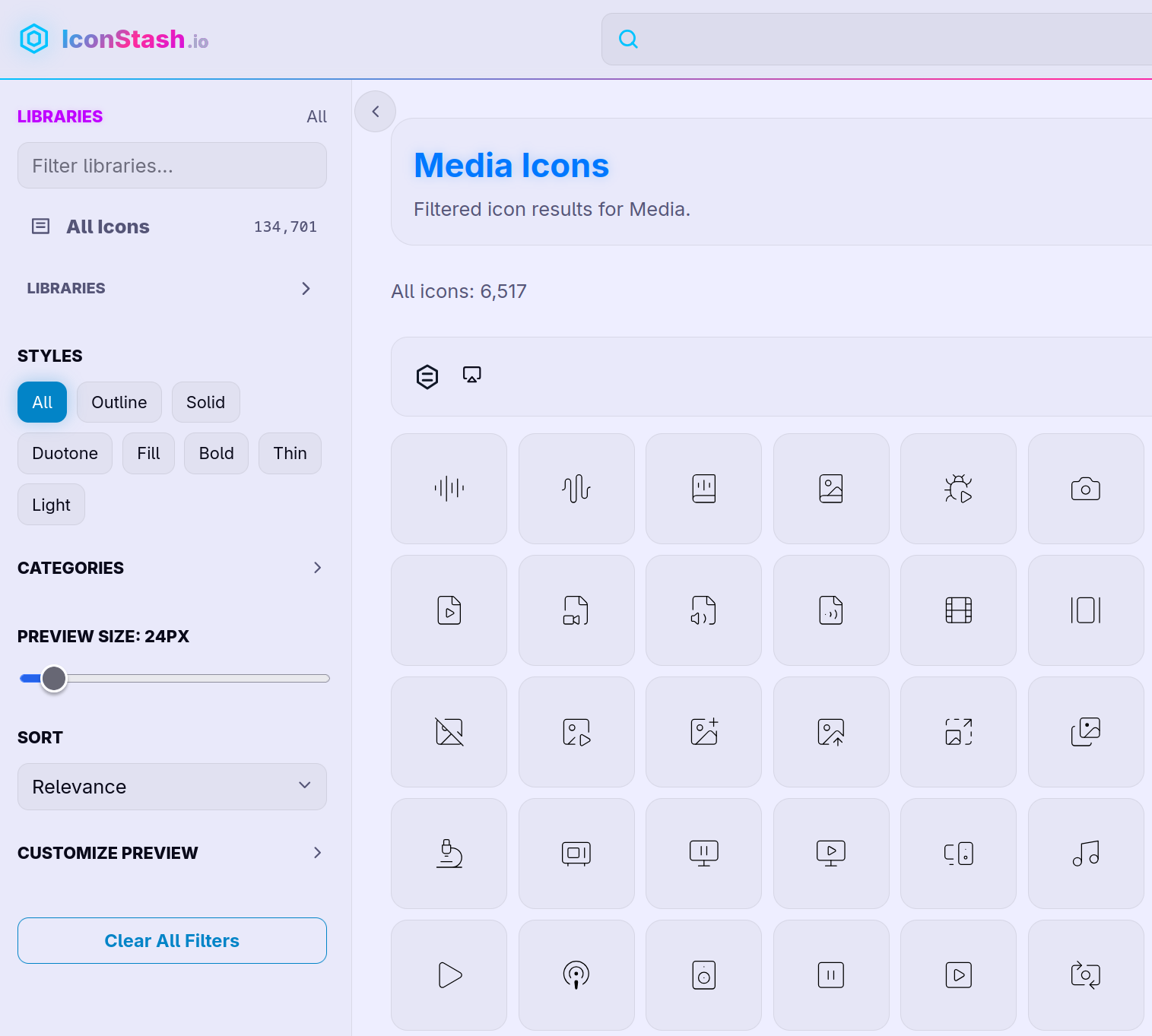
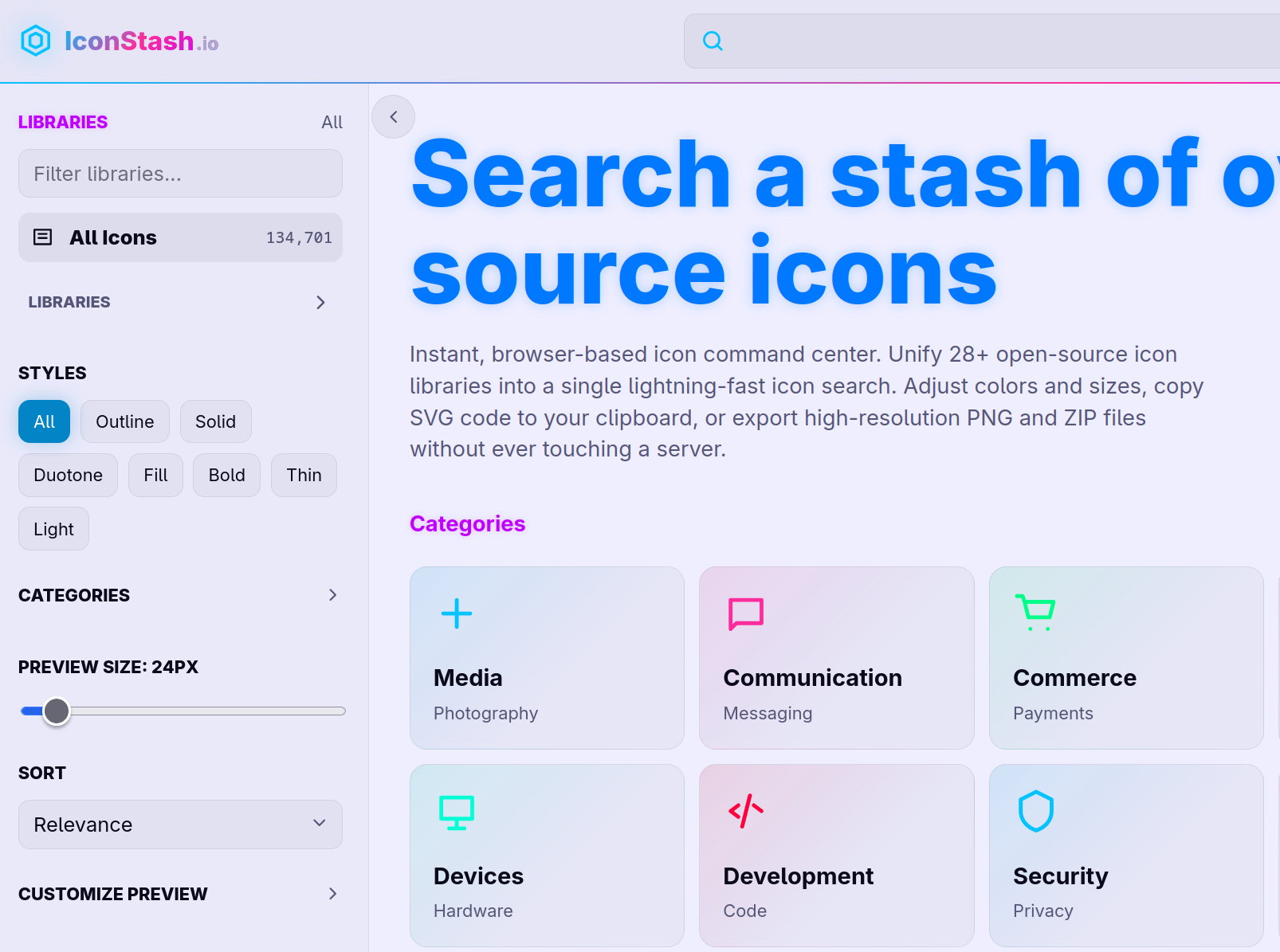
→ Search Lucide, Tabler, Phosphor, Material, Remix, Bootstrap Icons, Heroicons and 20+ more, all in one search
→ Filter by style — outline, solid, duotone, fill, bold, thin
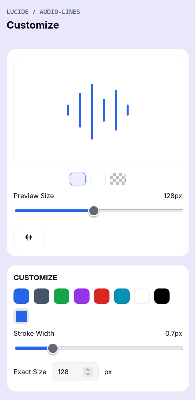
→ Live color picker and stroke width control, see changes instantly
→ Copy as SVG, JSX, Vue, or Svelte with one click
→ Download PNG from 16px to 512px
→ Select multiple icons and download them all as one ZIP
→ Save icons into named collections for your projects
→ See the exact same icon across every library side by side before picking one
→ Get the npm install command for whichever library you land on
No account. No login. No backend touching your data. Runs 100% in your browser.
Use Cases
Search open source icons

Comments


I really like the idea behind IconStash. It’s an interesting, positive, and clearly useful concept: offering a large collection of icons from many libraries in one place, with the ability to customize size, color, and format (SVG/PNG/ZIP). This is a great thought and solid execution. However, there are a few problems that need to be addressed: Color palette is visually harsh – In both light and dark themes, the color scheme is very unpleasant and hurts the eyes. The bright blue font in the header, combined with yellow, green, and lime-green icon colors, creates strong visual irritation. No way back from an icon detail page – When I select an icon and open its detail page, there is no close button or back button. I can only return by clicking the “Logo” and losing my current search and position in the list. Color accessibility is not optimized – The current colors do not seem adapted for different theme modes and likely fail color accessibility guidelines. Visual noise from icon variety – The high variety of icon colors and styles together creates visual clutter, especially when scrolling through large lists. Fixing these issues would significantly improve the UX and make IconStash even more valuable for designers and developers.

Premium Products





























Sponsors
Buy

Makers

Makers
Comments
I really like the idea behind IconStash. It’s an interesting, positive, and clearly useful concept: offering a large collection of icons from many libraries in one place, with the ability to customize size, color, and format (SVG/PNG/ZIP). This is a great thought and solid execution. However, there are a few problems that need to be addressed: Color palette is visually harsh – In both light and dark themes, the color scheme is very unpleasant and hurts the eyes. The bright blue font in the header, combined with yellow, green, and lime-green icon colors, creates strong visual irritation. No way back from an icon detail page – When I select an icon and open its detail page, there is no close button or back button. I can only return by clicking the “Logo” and losing my current search and position in the list. Color accessibility is not optimized – The current colors do not seem adapted for different theme modes and likely fail color accessibility guidelines. Visual noise from icon variety – The high variety of icon colors and styles together creates visual clutter, especially when scrolling through large lists. Fixing these issues would significantly improve the UX and make IconStash even more valuable for designers and developers.
Premium Products
New to Fazier?

Find your next favorite product or submit your own. Made by @FalakDigital.
Copyright ©2026. All Rights Reserved