Launch
Droptest Design
Visit
Premium
Example Image

Droptest Design

UI Feedback In Seconds.

Visit

Web designers,

Collecting feedback from web design clients can be a real hassle. Texts, Zoom calls, Loom videos, screenshots with drawings, Slack... the list goes on.

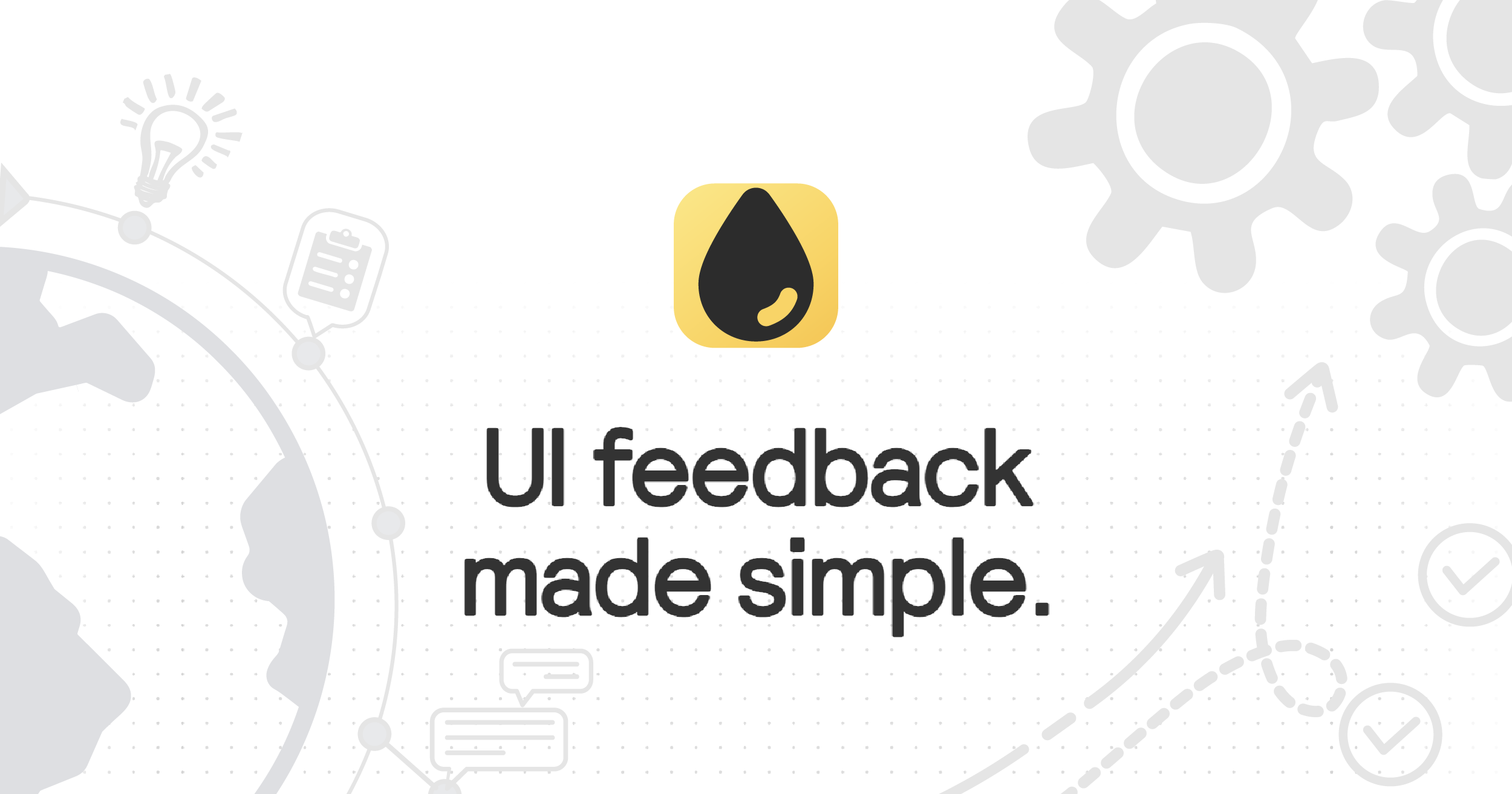
Droptest condenses review rounds into a single link.

Example Image
Example Image
Example Image
Example Image

Features

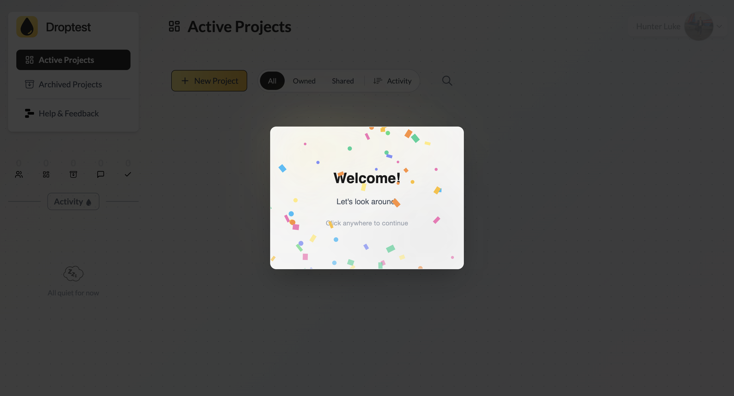
1 - Create a project with your site's live URL.

2 - Send an invite to clients.

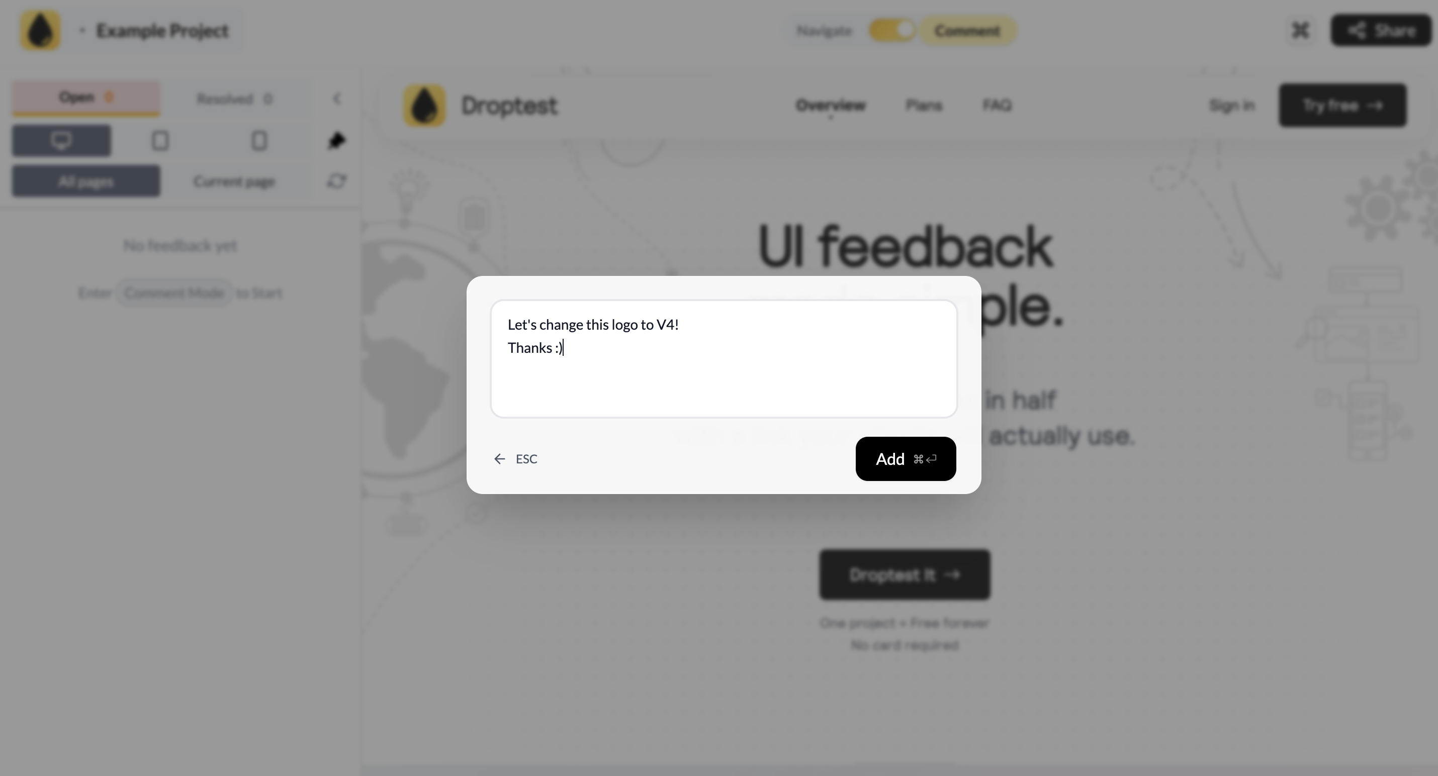
3 - Watch the feedback flow! Clients can leave their feedback directly on an intuitive, visual interface, making your job easier.

Use Cases

If you build with Framer, Webflow, Wix, Shopify, or WordPress, this is for you 😘

Fazier Deal
See coupon Copied!

Comments

custom-img
Shipping like a sailor!

Droptest is a cheaper, simpler, faster alternative to Markup, and especially useful for web designers who use Webflow, Framer, Wordpress, or Shopify. I've had a ton of fun building it! Let me know what you think could be better :)

custom-img
I am a person who loves new technologies...

Droptest sounds like a lifesaver for design feedback! I'm always looking for ways to streamline the process. Speaking of design, have you ever needed a quick and easy way to generate an odd font style for a project? It's surprisingly useful sometimes! https://freakyfontgen.org

custom-img
Love to test friends and give them a cha...

It's a very useful Platform. I use it and it helped me alot to make websites easily.

custom-img
Founder at Pipeout - B2B sales automatio...

UI feedback in seconds is a compelling value prop for product teams. Getting real user reactions to design mockups before committing to development saves significant time and reduces the risk of building the wrong thing. The speed angle is what makes this stand out for fast-moving product teams.

The single-link approach is what makes this practical. I've been on the client side of feedback rounds where context gets scattered across email threads, Slack messages, and random Loom links — by the time you piece it all together, half the annotations don't make sense anymore. Having everything consolidated in one place with visual markup directly on the design is the way it should've always worked. Would love to see how it handles responsive designs — do reviewers see the mobile vs. desktop version side by side?

custom-img
Building KeywordKick — chat with your SE...

Nice execution. Would be great to see how this performs in real use cases.

Fast UI feedback is most useful when teams can react on specific screens instead of collecting vague opinions in chat. A clear compare view between iterations would make this even more valuable for product and design reviews.

See coupon Copied!
View all
Example Image
Social Links
Awards
View all
Example Image
custom-img
Shipping like a sailor!
Makers
custom-img
Shipping like a sailor!

Comments

custom-img
Shipping like a sailor!

Droptest is a cheaper, simpler, faster alternative to Markup, and especially useful for web designers who use Webflow, Framer, Wordpress, or Shopify. I've had a ton of fun building it! Let me know what you think could be better :)

custom-img
I am a person who loves new technologies...

Droptest sounds like a lifesaver for design feedback! I'm always looking for ways to streamline the process. Speaking of design, have you ever needed a quick and easy way to generate an odd font style for a project? It's surprisingly useful sometimes! https://freakyfontgen.org

custom-img
Love to test friends and give them a cha...

It's a very useful Platform. I use it and it helped me alot to make websites easily.

custom-img
Founder at Pipeout - B2B sales automatio...

UI feedback in seconds is a compelling value prop for product teams. Getting real user reactions to design mockups before committing to development saves significant time and reduces the risk of building the wrong thing. The speed angle is what makes this stand out for fast-moving product teams.

The single-link approach is what makes this practical. I've been on the client side of feedback rounds where context gets scattered across email threads, Slack messages, and random Loom links — by the time you piece it all together, half the annotations don't make sense anymore. Having everything consolidated in one place with visual markup directly on the design is the way it should've always worked. Would love to see how it handles responsive designs — do reviewers see the mobile vs. desktop version side by side?

custom-img
Building KeywordKick — chat with your SE...

Nice execution. Would be great to see how this performs in real use cases.

Fast UI feedback is most useful when teams can react on specific screens instead of collecting vague opinions in chat. A clear compare view between iterations would make this even more valuable for product and design reviews.